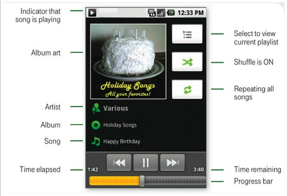
It’s… it’s like looking into the Eye of Sauron. If each application were a different Eye.
More at Gizmodo.

Pete Mortensen is a design strategist for consulting firm Jump Associates and the co-author of Wired to Care: How Companies Prosper When They Create Widespread Empathy, a book and blog that are significantly more interesting than you might initially think. Pete’s particular Apple avocations are both around design–interface and industrial. Follow him on Twitter!



6 responses to “T-Mobile G1 User Guide Reveals Hypnotic, Confusing UI”
I don’t see what’s so confusing about it. Even without the labels, I’d have been able to figure out what everything was.
yeah, you guys a stretching a bit there to dis the G1.
oh god, how horrible… its not chrome enough